Treating it as a flex tool
KLinePic renders what your CSV says. It will not invent a bigger green candle or a better exit, so use it as an honest recap — the credibility is the feature, not a limitation.
Trade recap image
A raw PnL screenshot is a single number with no context — easy to crop, easy to doctor, and easy to disbelieve. A trade recap image is different: an annotated K-line chart built from your real fills, with entry and exit markers on the actual candles, the holding window, the return, and the drawdown all drawn in. Same trade, but now it is verifiable at a glance.
KLinePic renders that recap from the fills you provide — no account needed to render, minutes from export to image. It charts what actually happened, which is exactly why the result is worth sharing.
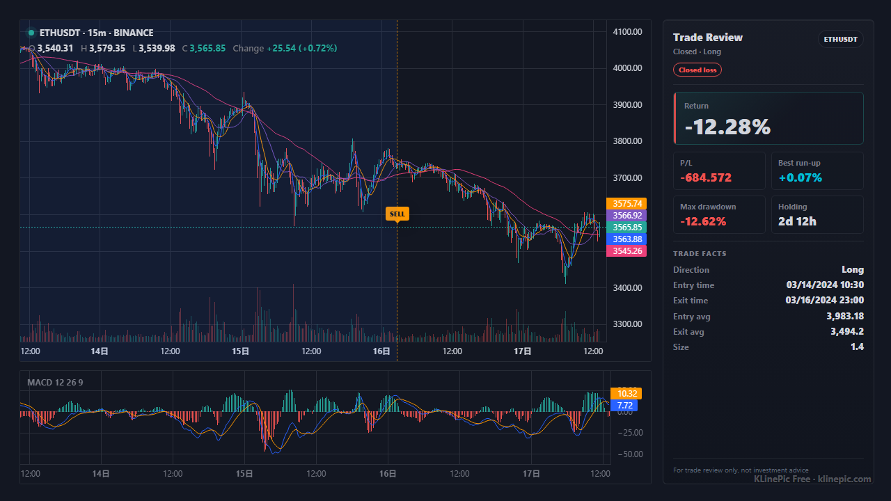
An exchange PnL card answers exactly one question — how much, in percent — and answers it in a form anyone can screenshot, crop, or edit. A trade recap answers the questions that make a trade believable and worth reviewing: where you got in, where you got out, how long you held, how far it ran in your favor, and how far it drew down against you. Those markers sit on the real K-line, so the story lines up with price history instead of floating free of it.
That honesty is the whole positioning. KLinePic charts the fills you give it and nothing else — it is not a tool for fabricating profit screenshots. A recap of a good trade looks good because the trade was good; a recap of a stopped-out trade shows the drawdown plainly. The upside is trust: a recap you can post to a journal, a chat, or a thread and stand behind, because it is grounded in your actual execution.
| KLinePic recap | Exchange PnL screenshot | Manual chart screenshot | |
|---|---|---|---|
| What it is built from | Your actual fills (CSV) | A single PnL / ROI figure | Whatever you drew by hand |
| Entry and exit on real candles | Yes, B/S markers at fill price and time | No — just a number and a percentage | Only if you place them yourself |
| Holding window, run-up, drawdown | Computed and labeled | Hidden | Rarely included |
| Ties back to price history | Yes, on real K-line data | Not shown | Depends on the screenshot |
| Honest about a loss | A red trade looks like a red trade | Easy to crop or hide | Easy to reframe |
| The deliverable | The annotated chart image itself | A figure that is easy to doctor | A static image without metrics |
| Setup effort | Export, map, paste — minutes | One tap, but low-trust | Slow, repeated by hand |
The recap works from any exchange or broker, because every source funnels into one small CSV schema. Bring your fills, map them once, render, and share.
The full field list — trade_id, symbol, event_type, position_side, time, price, quantity, fee, note — is documented in the data protocol. Extra columns are ignored on import and listed back to you, so you can leave an export's spare columns in place and only copy details such as the fee currency into note when you want them preserved.
One complete round-trip — a buy and a sell that share a trade_id — looks like this after mapping. The crypto exchange template ships this exact header so you can paste mapped rows straight in.
trade_id,symbol,event_type,position_side,time,price,quantity,fee,note
RECAP-ETH-001,ETHUSDT,buy,long,2026-05-10T09:15:00+00:00,2450.25,1.2,0.0012,fee_asset=ETH
RECAP-ETH-001,ETHUSDT,sell,long,2026-05-10T18:45:00+00:00,2528.70,1.2,3.03,fee_asset=USDT
Scaling in or out just adds more rows with the same trade_id, so a recap can show several entries and exits on one chart. A stock, futures, or forex recap uses the same shape — only the symbol and timestamps change.
KLinePic renders what your CSV says. It will not invent a bigger green candle or a better exit, so use it as an honest recap — the credibility is the feature, not a limitation.
If timestamps carry no offset and get read as local time, every marker shifts by hours. Write the offset explicitly — +00:00 — in time so B/S markers land on the right candles.
Order history records what you asked for — limit prices, canceled orders — not what executed. Keep only rows with a real fill price and size, or the recap marks trades that never happened.
One order can execute in several fills. Give them a shared trade_id; otherwise a single scale-in reads as several unrelated trades and the holding window is wrong.
Exports often carry both the executed base amount and its quote total. quantity must be the base amount (1.2 ETH), not the USDT value of the fill.
The point of a recap is context. Keep run-up and drawdown in the frame — hiding them turns an honest review back into a screenshot no one can check.
A trade recap image is an annotated K-line chart built from your real fills — entry and exit markers on the actual candles, plus holding window, return, max run-up, and max drawdown. It is the honest, shareable version of a trade you would otherwise post as a raw PnL screenshot.
No. KLinePic charts the fills you provide and nothing else. It is not a PnL-screenshot faker — the markers sit at the prices and times in your CSV, so the recap only looks good when the trade actually went well. That is the point: a credible image you can stand behind.
Any source you can export to rows with a symbol, side, time, price, and size. That includes crypto exchange fills (Binance, OKX, Bybit, Bitget, Gate, MEXC, KuCoin, HTX), US stock brokers, China A-share statements, futures, forex, and MetaTrader. Everything maps to the same CSV schema.
No. Paste or upload your CSV at klinepic.com and render — no account and no API key are required. For automation there is a documented Agent API and a CSV/JSON data protocol.
Yes, and it is one of the best uses. A recap of a stopped-out trade shows exactly where entry, exit, and drawdown landed on the candles, which makes it far more useful for a journal or a post-mortem than a red PnL number alone.
Yes. Batch rendering turns a month of fills into a full set of recap images in one pass, via the web UI or the documented Agent API.